CSS Tutorial
Introduction - Free CSS Tutorial

Cascading Style Sheets (CSS) is a fantastic tool to add layout to your websites. It can save you a lot of time and it enables you to design websites in a completely new way. CSS is a must for anyone working with web design.
This tutorial will get you started with CSS in just a few hours. It is easy to understand and it will teach you all the sophisticated techniques.
Learning CSS is fun. As you go along through the tutorial, remember to take enough time to properly experiment with what you learn in each lesson.
Using CSS
requires basic experience with HTML. If you are not familiar with HTML, please start with
our HTML tutorial before moving on to CSS.
Which software do I need?
Please avoid using software such as FrontPage, DreamWeaver or Word with this tutorial. Advanced software will not help you learn CSS. Instead, it will limit you and slow down your learning curve significantly.
All you need is a free and simple text editor.
For example, Microsoft Windows comes with a program called Notepad. It is usually located in Accessories in the start menu under Programs. Alternatively, you can use a similar text editor e.g. Pico for Linux or Simple Text for Macintosh.
A simple text editor is ideal for learning HTML and CSS because it doesn't affect or change the codes you type. That way, your successes and errors can only be attributed to yourself - not the software.
You can use any browser with this tutorial. We encourage you to always keep your browser updated and use the latest version.
A browser and a simple text editor is all you need.
Let's get started!
Lesson 1: What is CSS?
Maybe you already heard about CSS without really knowing what it is. In this lesson you will learn more about what CSS is and what it can do for you.
CSS is an acronym for Cascading Style Sheets.
What can I do with CSS?
CSS is a style language that defines layout of HTML documents. For example, CSS covers fonts, colours, margins, lines, height, width, background images, advanced positions and many other things. Just wait and see!
HTML can be (mis-)used to add layout to websites. But CSS offers more options and is more accurate and sophisticated. CSS is supported by all browsers today.
After only a few lessons of this tutorial you will be able to make your own style sheets using CSS to give your website a new great look.
What is the difference between CSS and HTML?
HTML is used to structure content. CSS is used for formatting structured content.
Okay, it sounds a bit technical and confusing. But please continue reading. It will all make sense to you soon.
Back in the good old days when Madonna was a virgin and a guy called Tim Berners Lee invented the World Wide Web, the language HTML was only used to add structure to text. An author could mark his text by stating "this is a headline" or "this is a paragraph" using HTML tags such as <h1> and <p>.
As the Web gained popularity, designers started looking for possibilities to add layout to online documents. To meet this demand, the browser producers (at that time Netscape and Microsoft) invented new HTML tags such as for example <font> which differed from the original HTML tags by defining layout - and not structure.
This also led to a situation where original structure tags such as <table> were increasingly being misused to layout pages instead of adding structure to text. Many new layout tags such as <blink> were only supported by one type of browser. "You need browser X to view this page" became a common disclaimer on web sites.
CSS was invented to remedy this situation by providing web designers with sophisticated layout opportunities supported by all browsers. At the same time, separation of the presentation style of documents from the content of documents, makes site maintenance a lot easier.
Which benefits will CSS give me?
CSS was a revolution in the world of web design. The concrete benefits of CSS include:
- control layout of many documents from one single style sheet;
- more precise control of layout;
- apply different layout to different media-types (screen, print, etc.);
- numerous advanced and sophisticated techniques.
In the
next lesson we take a closer look at how CSS actually works and how you get started.
Lesson 2: How does CSS work?
In this lesson you will learn how to make your first style sheet. You will get to know about the basic CSS model and which codes are necessary to use CSS in an HTML document.
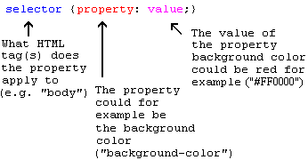
Many of the properties used in Cascading Style Sheets (CSS) are similar to those of HTML. Thus, if you are used to use HTML for layout, you will most likely recognize many of the codes. Let us look at a concrete example.
The basic CSS syntax
Let's say we want a nice red color as the background of a webpage:
Using HTML we could have done it like this:
With CSS the same result can be achieved like this:
body {background-color: #FF0000;}
As you will note, the codes are more or less identical for HTML and CSS. The above example also shows you the fundamental CSS model:
But where do you put the CSS code? This is exactly what we will go over now.
Applying CSS to an HTML document
There are three ways you can apply CSS to an HTML document. These methods are all outlined below. We recommend that you focus on the third method i.e. external.
Method 1: In-line (the attribute style)
One way to apply CSS to HTML is by using the HTML attribute style. Building on the above example with the red background color, it can be applied like this:
<html>
   <head>
  <title>Example</title>
   </head>
   <body style="background-color: #FF0000;">
  <p>This is a red page</p>
   </body>
 </html>
Method 2: Internal (the tag style)
Another way is to include the CSS codes using the HTML tag <style>. For example like this:
<html>
   <head>
  <title>Example</title>
  <style type="text/css">
    body {background-color: #FF0000;}
  </style>
   </head>
   <body>
  <p>This is a red page</p>
   </body>
 </html>
Method 3: External (link to a style sheet)
The recommended method is to link to a so-called external style sheet. Throughout this tutorial we will use this method in all our examples.
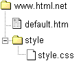
An external style sheet is simply a text file with the extension .css. Like any other file, you can place the style sheet on your web server or hard disk.
For example, let's say that your style sheet is named style.css and is located in a folder named style. The situation can be illustrated like this:
The trick is to create a link from the HTML document (default.htm) to the style sheet (style.css). Such link can be created with one line of HTML code:
<link rel="stylesheet" type="text/css" href="style/style.css" />
Notice how the path to our style sheet is indicated using the attribute href.
The line of code must be inserted in the header section of the HTML code i.e. between the <head> and </head> tags. Like this:
<html>
   <head>
  <title>My document</title>
  <link rel="stylesheet" type="text/css" href="style/style.css" />
   </head>
   <body>
   ...
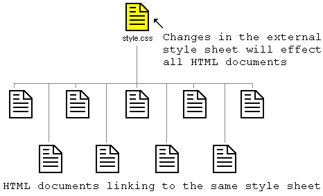
This link tells the browser that it should use the layout from the CSS file when displaying the HTML file.
The really smart thing is that several HTML documents can be linked to the same style sheet. In other words, one CSS file can be used to control the layout of many HTML documents.
This technique can save you a lot of work. If you, for example, would like to change the background color of a website with 100 pages, a style sheet can save you from having to manually change all 100 HTML documents. Using CSS, the change can be made in a few seconds just by changing one code in the central style sheet.
Let's put what we just learned into practice.
Try it yourself
Open Notepad (or whatever text editor you use) and create two files - an HTML file and a CSS file - with the following contents:
default.htm
<html>
   <head>
  <title>My document</title>
  <link rel="stylesheet" type="text/css" href="style.css" />
   </head>
   <body>
  <h1>My first stylesheet</h1>
   </body>
 </html>
style.css
body {
   background-color: #FF0000;
 }
Now place the two files in the same folder. Remember to save the files with the right extensions (respectively ".htm" and ".css")
Open default.htm with your browser and see how the page has a red background. Congratulations! You have made your first style sheet!
Hurry on to the
next lesson where we will take a look at some of the properties in CSS.
Lesson 3: Colors and backgrounds
In this lesson you will learn how to apply colors and background colors to your websites. We will also look at advanced methods to position and control background images. The following CSS properties will be explained:
Foreground color: the 'color' property
The color property describes the foreground color of an element.
For example, imagine that we want all headlines in a document to be dark red. The headlines are all marked with the HTML element <h1>. The code below sets the color of <h1> elements to red.
Colors can be entered as hexadecimal values as in the example above (#ff0000), or you can use the names of the colors ("red") or rgb-values (rgb(255,0,0)).
The 'background-color' property
The background-color property describes the background color of elements.
The element <body> contains all the content of an HTML document. Thus, to change the background color of an entire page, the background-color property should be applied to the <body> element.
You can also apply background colors to other elements including headlines and text. In the example below, different background colors are applied to <body> and <h1> elements.
 body {
  background-color: #FFCC66;
 }

 h1 {
  color: #990000;
  background-color: #FC9804;
 }
Notice that we applied two properties to <h1> by dividing them by a semicolon.
Background images [background-image]
The CSS property background-image is used to insert a background image.
As an example of a background image, we use the butterfly below. You can download the image so you can use it on your own computer (right click the image and choose "save image as"), or you can use another image as you see fit.
To insert the image of the butterfly as a background image for a web page, simply apply the background-image property to <body> and specify the location of the image.
 body {
  background-color: #FFCC66;
  background-image: url("butterfly.gif");
 }

 h1 {
  color: #990000;
  background-color: #FC9804;
 }
NB: Notice how we specified the location of the image as url("butterfly.gif"). This means that the image is located in the same folder as the style sheet. You can also refer to images in other folders using url("../images/butterfly.gif") or even on the Internet indicating the full address of the file: url("http://www.html.net/butterfly.gif").
Repeat background image [background-repeat]
In the example above, did you notice that by default the butterfly was repeated both horizontally and vertically to cover the entire screen? The property background-repeat controls this behaviour.
The table below outlines the four different values for background-repeat.
| Value | Description | Example |
|---|
background-repeat: repeat-x | The image is repeated horizontally | Show example |
background-repeat: repeat-y | The image is repeated vertically | Show example |
background-repeat: repeat | The image is repeated both horizontally and vertically | Show example |
background-repeat: no-repeat | The image is not repeated | Show example |
For example, to avoid repetition of a background image the code should look like this:
 body {
  background-color: #FFCC66;
  background-image: url("butterfly.gif");
  background-repeat: no-repeat;
 }

 h1 {
  color: #990000;
  background-color: #FC9804;
 }
Lock background image [background-attachment]
The property background-attachment specifies whether a background picture is fixed or scrolls along with the containing element.
A fixed background image will not move with the text when a reader is scrolling the page, whereas an unlocked background image will scroll along with the text of the web page.
The table below outlines the two different values for background-attachment. Click on the examples to see the difference between scroll and fixed.
| Value | Description | Example |
|---|
Background-attachment: scroll | The image scrolls with the page - unlocked | Show example |
Background-attachment: fixed | The image is locked | Show example |
For example, the code below will fix the background image.
 body {
  background-color: #FFCC66;
  background-image: url("butterfly.gif");
  background-repeat: no-repeat;
  background-attachment: fixed;
 }

 h1 {
  color: #990000;
  background-color: #FC9804;
 }
Place background image [background-position]
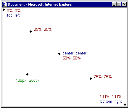
By default, a background image will be positioned in the top left corner of the screen. The property background-position allows you to change this default and position the background image anywhere you like on the screen.
There are numerous ways to set the values of background-position. However, all of them are formatted as a set of coordinates. For example, the value '100px 200px' positions the background image 100px from the left side and 200px from the top of the browser window.
The coordinates can be indicated as percentages of the browser window, fixed units (pixels, centimetres, etc.) or you can use the words top, bottom, center, left and right. The model below illustrates the system:
The table below gives some examples.
| Value | Description | Example |
|---|
background-position: 2cm 2cm | The image is positioned 2 cm from the left and 2 cm down the page | Show example |
background-position: 50% 25% | The image is centrally positioned and one fourth down the page | Show example |
background-position: top right | The image is positioned in the top-right corner of the page | Show example |
The code example below positions the background image in the bottom right corner:
 body {
  background-color: #FFCC66;
  background-image: url("butterfly.gif");
  background-repeat: no-repeat;
  background-attachment: fixed;
  background-position: right bottom;
 }

 h1 {
  color: #990000;
  background-color: #FC9804;
 }
Compiling [background]
The property background is a short hand for all the background properties listed in this lesson.
With background you can compress several properties and thereby write your style sheet in a shorter way which makes it easier to read.
For example, look at these five lines:
 background-color: #FFCC66;
 background-image: url("butterfly.gif");
 background-repeat: no-repeat;
 background-attachment: fixed;
 background-position: right bottom;
Using background the same result can be achieved in just one line of code:
background: #FFCC66 url("butterfly.gif") no-repeat fixed right bottom;
The list of order is as follows:
[background-color] | [background-image] | [background-repeat] | [background-attachment] | [background-position]
If a property is left out, it will automatically be set to its default value. For example, if background-attachment and background-position are taken out of the example:
background: #FFCC66 url("butterfly.gif") no-repeat;
These two properties that are not specified would merely be set to their default values which as you know are scroll and top left.
Summary
In this lesson, you have already learned new techniques that would not be possible using HTML. The fun continues in the
next lesson which examines the broad range of possibilities when using CSS to describe fonts.
Lesson 4: Fonts
In this lesson you will learn about fonts and how they are applied using CSS. We will also look at how to work around the issue that specific fonts chosen for a website can only be seen if the font is installed on the PC used to access the website. The following CSS properties will be described:
Font family [font-family]
The property font-family is used to set a prioritized list of fonts to be used to display a given element or web page. If the first font on the list is not installed on the computer used to access the site, the next font on the list will be tried until a suitable font is found.
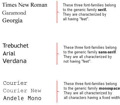
There are two types of names used to categorize fonts: family-names and generic families. The two terms are explained below.
- Family-name
- Examples of a family-name (often known as "font") can e.g. be "Arial", "Times New Roman" or "Tahoma".
- Generic family
- Generic families can best be described as groups of family-names with uniformed appearances. An example is sans-serif, which is a collection of fonts without "feet".
The difference can also be illustrated like this:
When you list fonts for your web site, you naturally start with the most preferred font followed by some alternative fonts. It is recommended to complete the list with a generic font family. That way at least the page will be shown using a font of the same family if none of the specified fonts are available.
An example of a prioritized list of fonts could look like this:
 h1 {font-family: arial, verdana, sans-serif;}
 h2 {font-family: "Times New Roman", serif;}
Headlines marked with <h1> will be displayed using the font "Arial". If this font is not installed on the user's computer, "Verdana" will be used instead. If both these fonts are unavailable, a font from the sans-serif family will be used to show the headlines.
Notice how the font name "Times New Roman" contains spaces and therefore is listed using quotation marks.
Font style [font-style]
The property font-style defines the chosen font either in normal, italic or oblique. In the example below, all headlines marked with <h2> will be shown in italics.
 h1 {font-family: arial, verdana, sans-serif;}
 h2 {font-family: "Times New Roman", serif; font-style: italic;}
Font variant [font-variant]
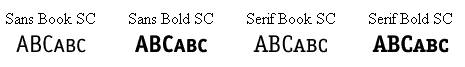
The property font-variant is used to choose between normal or small-caps variants of a font. A small-caps font is a font that uses smaller sized capitalized letters (upper case) instead of lower case letters. Confused? Take a look at these examples:
If font-variant is set to small-caps and no small-caps font is available the browser will most likely show the text in uppercase instead.
 h1 {font-variant: small-caps;}
 h2 {font-variant: normal;}
Font weight [font-weight]
The property font-weight describes how bold or "heavy" a font should be presented. A font can either be normal or bold. Some browsers even support the use of numbers between 100-900 (in hundreds) to describe the weight of a font.
 p {font-family: arial, verdana, sans-serif;}
 td {font-family: arial, verdana, sans-serif; font-weight: bold;}
Font size [font-size]
The size of a font is set by the property font-size.
There are many different units (e.g. pixels and percentages) to choose from to describe font sizes. In this tutorial we will focus on the most common and appropriate units. Examples include:
 h1 {font-size: 30px;}
 h2 {font-size: 12pt;}
 h3 {font-size: 120%;}
 p {font-size: 1em;}
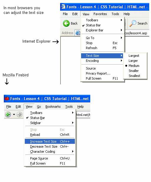
There is one key difference between the four units above. The units 'px' and 'pt' make the font size absolute, while '%' and 'em' allow the user to adjust the font size as he/she see fit. Many users are disabled, elderly or simply suffer from poor vision or a monitor of bad quality. To make your website accessible for everybody, you should use adjustable units such as '%' or 'em'.
Below you can see an illustration of how to adjust the text size in Mozilla Firefox and Internet Explorer. Try it yourself - neat feature, don't you think?
Compiling [font]
Using the font short hand property it is possible to cover all the different font properties in one single property.
For example, imagine these four lines of code used to describe font-properties for <p>:
 p {
  font-style: italic;
  font-weight: bold;
  font-size: 30px;
  font-family: arial, sans-serif;
 }
Using the short hand property, the code can be simplified:
 p {
  font: italic bold 30px arial, sans-serif;
 }
The order of values for font is:
font-style | font-variant | font-weight | font-size | font-family
Summary
You have now learned about some of the possibilities related to fonts. Remember that one of the major advantages of using CSS to specify fonts is that at any given time, you can change font on an entire website in just a few minutes. CSS saves time and makes your life easier. In the
next lesson we will look at text.
Lesson 5: Text
Formatting and adding style to text is a key issue for any web designer. In this lesson you will be introduced to the amazing opportunities CSS gives you to add layout to text. The following properties will be described:
Text indention [text-indent]
The property text-indent allows you to add an elegant touch to text paragraphs by applying an indent to the first line of the paragraph. In the example below a 30px is applied to all text paragraphs marked with <p>:
Text alignment [text-align]
The CSS property text-align corresponds to the attribute align used in old versions of HTML. Text can either be aligned to the left, to the right or centred. In addition to this, the value justify will stretch each line so that both the right and left margins are straight. You know this layout from for example newspapers and magazines.
In the example below the text in table headings <th> is aligned to the right while the table data <td> are centred. In addition, normal text paragraphs are justified:
 th {
  text-align: right;
 }

 td {
  text-align: center;
 }

 p {
  text-align: justify;
 }
Text decoration [text-decoration]
The property text-decoration makes it is possible to add different "decorations" or "effects" to text. For example, you can underline the text, have a line through or above the text, etc. In the following example, <h1> are underlined headlines, <h2> are headlines with a line above the text and <h3> are headlines with a line though the text.
 h1 {
  text-decoration: underline;
 }

 h2 {
  text-decoration: overline;
 }

 h3 {
  text-decoration: line-through;
 }
Letter space [letter-spacing]
The spacing between text characters can be specified using the property letter-spacing. The value of the property is simply the desired width. For example, if you want a spacing of 3px between the letters in a text paragraph <p> and 6px between letters in headlines <h1> the code below could be used.
 h1 {
  letter-spacing: 6px;
 }

 p {
  letter-spacing: 3px;
 }
Text transformation [text-transform]
The text-transform property controls the capitalization of a text. You can choose to capitalize, use uppercase or lowercase regardless of how the original text is looks in the HTML code.
An example could be the word "headline" which can be presented to the user as "HEADLINE" or "Headline". There are four possible values for text-transform:
- capitalize
- Capitalizes the first letter of each word. For example: "john doe" will be "John Doe".
- uppercase
- Converts all letters to uppercase. For example: "john doe" will be "JOHN DOE".
- lowercase
- Converts all letters to lowercase. For example: "JOHN DOE" will be "john doe".
- none
- No transformations - the text is presented as it appears in the HTML code.
As an example, we will use a list of names. The names are all marked with <li> (list-item). Let's say that we want names to be capitalized and headlines to be presented in uppercase letters.
Try to take a look at the HTML code for this example and you will see that the text actually is in lowercase.
 h1 {
  text-transform: uppercase;
 }

 li {
  text-transform: capitalize;
 }
Summary
In the last three lessons you have already learned several CSS properties, but there is much more to CSS. In the
next lesson we will take a look at links.
Lesson 6: Links
You can apply what you already learned in the previous lessons to links (i.e. change colors, fonts, underline, etc). The new thing is that CSS allows you to define these properties differently depending on whether the link is unvisited, visited, active, or whether the cursor is on the link. This makes it possible to add fancy and useful effects to your website. To control these effects you use so-called pseudo-classes.
What is a pseudo-class?
A pseudo-class allows you to take into account different conditions or events when defining a property for an HTML tag.
Let's look at an example. As you know, links are specified in HTML with <a> tags. We can therefore use a as a selector in CSS:
A link can have different states. For example, it can be visited or not visited. You can use pseudo-classes to assign different styles to visited and unvisited links.
a:link {
color: blue;
}
a:visited {
color: red;
}
Use a:link and a:visited for unvisited and visited links respectively. Links that are active have the pseudo-class a:active and a:hover is when the cursor is on the link.
We will now go through each of the four pseudo-classes with examples and further explanation.
Pseudo-class: link
The pseudo-class :link is used for links leading to pages that the user has not visited.
In the code example below, unvisited links will be light blue.
a:link {
color: #6699CC;
}
Pseudo-class: visited
The pseudo-class :visited is used for links leading to pages that the user has visited. For example, the code below would make all visited links dark purple:
a:visited {
color: #660099;
}
Pseudo-class: active
The pseudo-class :active is used for links that are active.
This example gives active links a yellow background color:
a:active {
background-color: #FFFF00;
}
Pseudo-class: hover
The pseudo-class :hover is used when the mouse pointer hovers over a link.
This can be used to create interesting effects. For example, if we want our links to be orange and be italicized when the cursor is pointed at them, our CSS should look like this:
a:hover {
color: orange;
font-style: italic;
}
Example 1: Effect when the cursor is over a link
It is particular popular to create different effects when the cursor is over a link. We will therefore look at a few extra examples related to the pseudo-class :hover.
Example 1a: Spacing between letters
As you will remember from
lesson 5, the spacing between letters can be adjusted using the property
letter-spacing. This can be applied to links for a special effect:
a:hover {
letter-spacing: 10px;
font-weight:bold;
color:red;
}
Example 1b: UPPERCASE and lowercase
In
lesson 5 we looked at the property
text-transform, which can switch between upper- and lowercase letters. This can also be used to create an effect for links:
a:hover {
text-transform: uppercase;
font-weight:bold;
color:blue;
background-color:yellow;
}
The two examples gives you an idea about the almost endless possibilities for combining different properties. You can create your own effects - give it a try!
Example 2: Remove underline of links
A frequently asked question is how to remove the underlining of links?
You should consider carefully whether it is necessary to remove the underlining as it might decrease usability of your website significantly. People are used to blue underlined links on web pages and know that they can click on them. Even my mum knows that! If you change the underlining and color of links there is a good chance that users will get confused and therefore not get the full benefit of the content on your website.
That said, it is very simple to remove the underlining of links. As you will recall from
lesson 5, the property
text-decoration can be used to determine whether text is underlined or not. To remove underlining, simply set the value of
text-decoration to none.
a {
text-decoration:none;
}
Alternatively, you can set text-decoration along with other properties for all four pseudo-classes.
a:link {
color: blue;
text-decoration:none;
}
a:visited {
color: purple;
text-decoration:none;
}
a:active {
background-color: yellow;
text-decoration:none;
}
a:hover {
color:red;
text-decoration:none;
}
Summary
In this lesson you have learned about pseudo-classes, using some of the properties from the previous lessons. This should give you an idea of some the possibilities CSS provides.
In the
next lesson we will teach you how to define properties for specific elements and groups of elements.
Lesson 7: Identification and grouping of elements (class and id)
Sometimes you want to apply a special style to a particular element or a particular group of elements. In this lesson, we will take a closer look at how you can use class and id to specify properties for selected elements.
How can you color one particular headline differently than the other headlines on your website? How can you group your links into different categories and give each category a special style? These are just examples of questions we will answer in this lesson.
Grouping elements with class
Let's say that we have two lists of links of different grapes used for white wine and red wine. The HTML code could look like this:
<p>Grapes for white wine:</p>
<ul>
<li><a href="ri.htm">Riesling</a></li>
<li><a href="ch.htm">Chardonnay</a></li>
<li><a href="pb.htm">Pinot Blanc</a></li>
</ul>
<p>Grapes for red wine:</p>
<ul>
<li><a href="cs.htm">Cabernet Sauvignon</a></li>
<li><a href="me.htm">Merlot</a></li>
<li><a href="pn.htm">Pinot Noir</a></li>
</ul>
Then we want the white wine links to be yellow, the red wine links to be red and the rest of the existing links on the webpage to stay blue.
To achieve this, we divide the links into two categories. This is done by assigning a class to each link using the attribute class.
Let us try to specify some classes in the example above:
<p>Grapes for white wine:</p>
<ul>
<li><a href="ri.htm" class="whitewine">Riesling</a></li>
<li><a href="ch.htm" class="whitewine">Chardonnay</a></li>
<li><a href="pb.htm" class="whitewine">Pinot Blanc</a></li>
</ul>
<p>Grapes for red wine:</p>
<ul>
<li><a href="cs.htm" class="redwine">Cabernet Sauvignon</a></li>
<li><a href="me.htm" class="redwine">Merlot</a></li>
<li><a href="pn.htm" class="redwine">Pinot Noir</a></li>
</ul>
We can hereafter define special properties for links belonging to whitewine and redwine, respectively.
 a {
  color: blue;
 }
a.whitewine {
color: #FFBB00;
}
a.redwine {
color: #800000;
}
As shown in the example you can define the properties for elements which belong to a certain class by using .classname in the style sheet of the document.
Identification of element using id
In addition to grouping elements, you might need to identify one unique element. This is done by using the attribute id.
What is special about the attribute id is that there can not be two elements in the same document with the same id. Each id has to be unique. In other cases, you should use the class attribute instead. Now, let us take a look at an example of a possible usage of id:
 <h1>Chapter 1</h1>
 ...
 <h2>Chapter 1.1</h2>
 ...
 <h2>Chapter 1.2</h2>
 ...
 <h1>Chapter 2</h1>
 ...
 <h2>Chapter 2.1</h2>
 ...
 <h3>Chapter 2.1.2</h3>
 ...
The above could be headings of any document split into chapters or paragraphs. It would be natural to assign an id to each chapter as follows:
 <h1 id="c1">Chapter 1</h1>
 ...
 <h2 id="c1-1">Chapter 1.1</h2>
 ...
 <h2 id="c1-2">Chapter 1.2</h2>
 ...
 <h1 id="c2">Chapter 2</h1>
 ...
 <h2 id="c2-1">Chapter 2.1</h2>
 ...
 <h3 id="c2-1-2">Chapter 2.1.2</h3>
 ...
Let us say that the headline for chapter 1.2 must be in red. This can be done accordingly with CSS:
As shown in the example above you can define the properties in a specific element by using #id in the stylesheet of the document.
Summary
In this lesson we have learned that through the use of the selectors, class and id, you are able to specify properties for specific elements.
In the
next lesson, we will take a closer look at two HTML-elements which is widely used in connection with CSS:
<span> and
<div>.
Lesson 8: Grouping of elements (span and div)
The elements <span> and <div> are used to group and structure a document and will often be used together with the attributes class and id.
In this lesson, we will take a closer look at the use of <span> and <div> as exactly these two HTML elements are of central importance with regards to CSS.
Grouping with <span>
The element <span> is what you could call a neutral element which does not add anything to the document itself. But with CSS, <span> can be used to add visual features to specific parts of text in your documents.
An example of this could be this Benjamin Franklin quotation:
 <p>Early to bed and early to rise
makes a man healthy, wealthy and wise.</p>
Lets us say we want what Mr. Franklin sees as the benefits of not sleeping your day away emphasized in red. For that purpose, we can mark the benefits with <span>. Each span is then added a class, which we can define in our style sheet:
 <p>Early to bed and early to rise
makes a man <span class="benefit">healthy</span>,
<span class="benefit">wealthy</span>
and <span class="benefit">wise</span>.</p>
The CSS belonging to it:
 span.benefit {
  color:red;
 }
Of course you may also use id to add style to the <span>-elements. Just as long as you remember, that you'll have to apply a unique id to each of the three <span>-elements, as you learned in the previous lesson.
Grouping with <div>
Whereas <span> is used within a block-level element as seen in the previous example, <div> is used to group one or more block-level elements.
Aside from this difference, the grouping with <div> works in more or less the same way. Let us take a look at an example with two lists of U.S. presidents divided into their political affiliations:
 <div id="democrats">
 <ul>
 <li>Franklin D. Roosevelt</li>
 <li>Harry S. Truman</li>
 <li>John F. Kennedy</li>
 <li>Lyndon B. Johnson</li>
 <li>Jimmy Carter</li>
 <li>Bill Clinton</li>
 </ul>
 </div>

 <div id="republicans">
 <ul>
 <li>Dwight D. Eisenhower</li>
 <li>Richard Nixon</li>
 <li>Gerald Ford</li>
 <li>Ronald Reagan</li>
 <li>George Bush</li>
 <li>George W. Bush</li>
 </ul>
 </div>
And in our style sheet, we can utilize the grouping in the exact same way as above:
 #democrats {
  background:blue;
 }

 #republicans {
  background:red;
 }
In the examples above, we have only used <div> and <span> on very simple things such as text and background colors. Both elements have the potential to do much more advanced things. However this will not be introduced in this lesson. We will look into these later in this tutorial.
Summary
In
lesson 7 and 8, you have learned about the selectors
id and
class and the elements
span and
div.
You should now be able to group and identify, more or less, all parts of a document, which is a big step in the direction of mastering CSS. In
lesson 9 we will introduce you to the box model.
Lesson 9: The box model
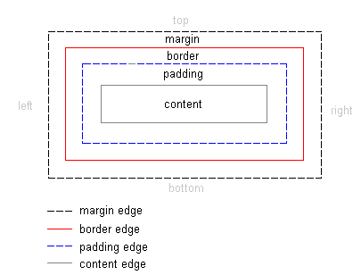
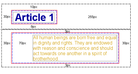
The box model in CSS describes the boxes which are being generated for HTML-elements. The box model also contains detailed options regarding adjusting margin, border, padding and content for each element. The diagram below shows how the box model is constructed:
The box model in CSS
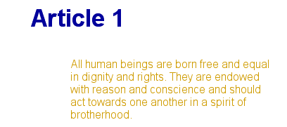
The illustration above might seem pretty theoretical to look at, so let's try to use the model in an actual case with a headline and some text. The HTML for our example is (from the Universal Declaration of Human Rights):
 <h1>Article 1:</h1>

 <p>All human beings are born free
 and equal in dignity and rights.
 They are endowed with reason and conscience
 and should act towards one another in a
 spirit of brotherhood</p>
By adding some color and font-information the example could be presented as follows:
The example contains two elements: <h1> and <p>. The box model for the two elements can be illustrated as follows:
Even though it may look a bit complicated, the illustration shows how each HTML-element is surrounded by boxes. Boxes which we can adjust using CSS.
<% '
The properties which regulate the different boxes are: padding, margin and border. The next two lessons deal with exactly these three properties:
'
'
When you have finished these two lessons, you will master the box model and be able to layout your documents much finer and more precise than in the old fashion using tables in HTML.
%>
Summary
In this lesson you have been introduced to the box model. In the following three lesson we will take a closer look at how to create and control elements in the box model.
Lesson 10: Margin and padding
In the previous lesson you were introduced to the box model. In this lesson, we will look at how you can change the presentation of elements by setting the
margin and
padding properties.
Set the margin in an element
An element has four sides: right, left, top and bottom. The
margin is the distance from each side to the neighboring element (or the borders of the document). See also the diagram in
lesson 9 for an illustration.
As the first example, we will look at how you define margins for the document itself i.e. for the element
<body>. The illustration below shows how we want the margins in our pages to be.
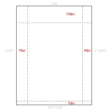
The CSS code for this would look as follow:
 body {
  margin-top: 100px;
  margin-right: 40px;
  margin-bottom: 10px;
  margin-left: 70px;
 }
Or you could choose a more elegant compilation:
 body {
  margin: 100px 40px 10px 70px;
 }
You can set the margins in the same way on almost every element. For example, we can choose to define margins for all of our text paragraphs marked with
<p>:
 body {
  margin: 100px 40px 10px 70px;
 }

 p {
  margin: 5px 50px 5px 50px;
 }
Set padding in an element
Padding can also be understood as "filling". This makes sense as padding does not affect the distance of the element to other elements but only defines the inner distance between the border and the content of the element.
The usage of padding can be illustrated by looking at a simple example where all headlines have background colors:
 h1 {
  background: yellow;
 }

 h2 {
  background: orange;
 }
By defining padding for the headlines, you change how much filling there will be around the text in each headline:
 h1 {
  background: yellow;
  padding: 20px 20px 20px 80px;
 }

 h2 {
  background: orange;
  padding-left:120px;
 }
Summary
You are now on your way to master the box model in CSS. In the next lesson, we will take a closer look at how to set borders in different colors and how to shape your elements.
Lesson 11: Borders
Borders can be used for many things, for example as a decorative element or to underline a separation of two things. CSS gives you endless options when using borders in your pages.
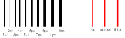
The width of borders [border-width]
The width of borders is defined by the property border-width, which can obtain the values thin, medium, and thick, or a numeric value, indicated in pixels. The figure below illustrates the system:
The color of borders [border-color]
The property border-color defines which color the border has. The values are the normal color-values for example "#123456", "rgb(123,123,123)" or "yellow" .
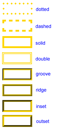
Types of borders [border-style]
There are different types of borders to choose from. Below are shown 8 different types of borders as Internet Explorer 5.5 interprets them. All examples are shown with the color "gold" and the thickness "thick" but can naturally be shown in other colors and thicknesses.
The values none or hidden can be used if you do not want any border.
Examples of defining borders
The three properties described above can be put together by each element and thereby produce different borders. To illustrate this, we will take a look at a document where we define different borders for <h1>, <h2>, <ul> and <p>. The result may not be that pretty but it illustrates some of the many possibilities:
 h1 {
  border-width: thick;
  border-style: dotted;
  border-color: gold;
 }

 h2 {
  border-width: 20px;
  border-style: outset;
  border-color: red;
 }

 p {
  border-width: 1px;
  border-style: dashed;
  border-color: blue;
 }

 ul {
  border-width: thin;
  border-style: solid;
  border-color: orange;
 }
It is also possible to state special properties for top-, bottom-, right- or left borders. The following example shows you how:
 h1 {
  border-top-width: thick;
  border-top-style: solid;
  border-top-color: red;

  border-bottom-width: thick;
  border-bottom-style: solid;
  border-bottom-color: blue;

  border-right-width: thick;
  border-right-style: solid;
  border-right-color: green;

  border-left-width: thick;
  border-left-style: solid;
  border-left-color: orange;
 }
Compilation [border]
As it is also the case for many other properties, you can compile many properties into one using border. Let us take a look at an example:
 p {
  border-width: 1px;
  border-style: solid;
  border-color: blue;
 }
Can be compiled into:
 p {
  border: 1px solid blue;
 }
Summary
In this lesson you have learned about the endless options CSS gives you when using borders in your pages.
In the next lesson, we will look at how you define the dimensions in the box model - height and width.
Lesson 12: Height and width
Up until now, we have not cared much about the dimensions of the elements we have worked with. In this lesson, we will take a look at how you easily can define the height and width of an element.
Setting the width [width]
With the
width-property, you can define a certain width of an element.
The simple example below provides us with a box wherein text can be typed:
 div.box {
  width: 200px;
  border: 1px solid black;
  background: orange;
 }
Setting the height [height]
In the example above notice how the height of the box is set by the content of the box. You can affect the height of an element with the property
height. As an example let us try to make the box in the example 500px high:
 div.box {
  height: 500px;
  width: 200px;
  border: 1px solid black;
  background: orange;
 }
Summary
Lesson 9,
10,
11 and
12 have given you an introduction to the box model in CSS. As you can probably see, the box model gives you many new options. You might have been using tables in HTML to create your layouts until now, but with CSS and the box model you should now be able to achieve elegant layouts more precisely and in accordance with the recommendations of W3C.
Lesson 13: Floating elements (floats)
An element can be floated to the right or to left by using the property
float. That is to say that the box with its contents either floats to the right or to the left in a document (or the containing box) (see
lesson 9 for a description of the Box model). The following figure illustrates the principle:
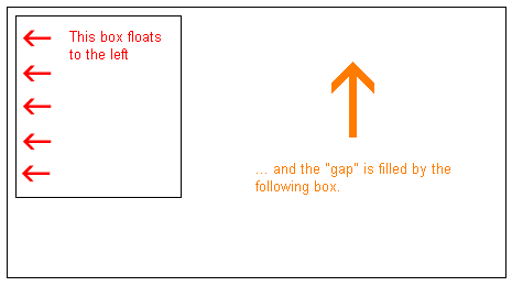
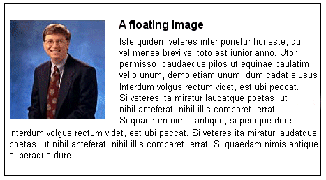
If we for example would like to have a text wrapping around a picture, the result would be like this:
How is it done?
The HTML code for the example above, look as follows:
 <div id="picture">
  <img src="bill.jpg" alt="Bill Gates">
 </div>

 <p>causas naturales et antecedentes,
 idciro etiam nostrarum voluntatum...</p>
To get the picture floating to the left and the text to surround it, you only have to define the width of the box which surrounds the picture and thereafter set the property
float to left:
 #picture {
  float:left;
  width: 100px;
 }
Another example: columns
Floats can also be used for columns in a document. To create the columns, you simply have to structure the desired columns in the HTML-code with
<div> as follows:
 <div id="column1">
  <p>Haec disserens qua de re agatur
  et in quo causa consistat non videt...</p>
 </div>

 <div id="column2">
  <p>causas naturales et antecedentes,
  idciro etiam nostrarum voluntatum...</p>
 </div>

 <div id="column3">
  <p>nam nihil esset in nostra
  potestate si res ita se haberet...</p>
 </div>
Now the desired width of the columns is set to e.g. 33%, and then you simply float each column to the left by defining the property
float:
 #column1 {
  float:left;
  width: 33%;
 }

 #column2 {
  float:left;
  width: 33%;
 }

 #column3 {
  float:left;
  width: 33%;
 }
float can be set as either
left,
right or
none.
The property clear
The
clear property is used to control how the subsequent elements of floated elements in a document shall behave.
By default, the subsequent elements are moved up to fill the available space which will be freed when a box is floated to a side. Look at the example above wherein the text is automatically moved up beside the picture of Bill Gates.
The property
clear can assume the values
left,
right,
both or
none. The principle is, if
clear, for example, is set to both for a box, the top margin border of this box will always be under the lower margin border for possible floating boxes coming from above.
 <div id="picture">
  <img src="bill.jpg" alt="Bill Gates">
 </div>

 <h1>Bill Gates</h1>

 <p class="floatstop">causas naturales et antecedentes,
 idciro etiam nostrarum voluntatum...</p>
To avoid the text from floating up next to the picture, we can add the following to our CSS:
 #picture {
  float:left;
  width: 100px;
 }

 .floatstop {
  clear:both;
 }
Summary
Floats are useful in many situations and will often be used together with positioning. In the
next lesson we will take a closer look at how to position a box, either relative or absolute.
Lesson 14: Positioning of elements
With CSS positioning, you can place an element exactly where you want it on your page. Together with floats (see
lesson 13), positioning gives you many possibilities to create an advanced and precise layout.
The following will be discussed in this lesson:
The principle behind CSS positioning
Imagine a browser window as a system of coordinates:
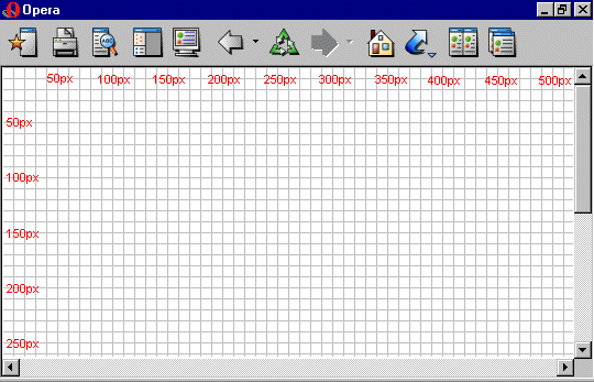
The principle behind CSS positioning is that you can position any box anywhere in the system of coordinates.
Let's say we want to position a headline. By using the box model (see
lesson 9) the headline will appear as follows:

If we want this headline positioned 100px from the top of the document and 200px from the left of the document, we could type the following in our CSS:
 h1 {
  position:absolute;
  top: 100px;
  left: 200px;
 }
The result will be as follows:
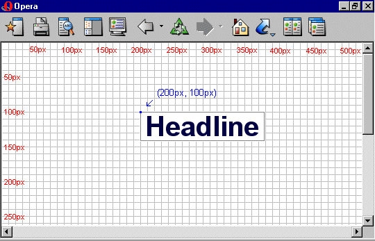
As you can see, positioning with CSS is a very precise technique to place elements. It is much easier than trying to use tables, transparent images or anything else.
Absolute positioning
An element which is positioned absolute does not obtain any space in the document. This means that it does not leave an empty space after being positioned.
To position an element absolutely, the
position property is set as
absolute. You can subsequently use the properties
left,
right,
top, and
bottom to place the box.
As an example of absolute positioning, we choose to place 4 boxes in each corner of the document:
 #box1 {
  position:absolute;
  top: 50px;
  left: 50px;
 }

 #box2 {
  position:absolute;
  top: 50px;
  right: 50px;
 }

 #box3 {
  position:absolute;
  bottom: 50px;
  right: 50px;
 }

 #box4 {
  position:absolute;
  bottom: 50px;
  left: 50px;
 }
Relative positioning
To position an element relatively, the property
position is set as
relative. The difference between absolute and relative positioning is how the position is being calculated.
The position for an element which is relatively positioned is
calculated from the original position in the document. That means that you move the element to the right, to the left, up or down. This way, the element still obtains a space in the document after it is positioned.
As an example of relative positioning, we can try to position three pictures relatively to their original position on the page. Notice how the pictures leave empty spaces at their original positions in the document:
 #dog1 {
  position:relative;
  left: 350px;
  bottom: 150px;
 }
 #dog2 {
  position:relative;
  left: 150px;
  bottom: 500px;
 }

 #dog3 {
  position:relative;
  left: 50px;
  bottom: 700px;
 }
Summary
In the previous two lessons, you learned how to float and position elements. These two methods give you many opportunities to construct your pages without having to use some of the old-fashioned methods with tables and transparent images in HTML. Use CSS instead. It is more precise, gives you more advantages, and it is also far easier to maintain.
Lesson 15: Layer on layer with z-index (Layers)
CSS operates in three dimensions - height, width and depth. We have seen the first two dimensions in previous lessons. In this lesson, we will learn how to let different elements become layers. In short, this means the order of which the elements overlap one another.
For that purpose, you can assign each element a number (
z-index). The system is that an element with a higher number overlaps an element with a lower number.
Let us say we are playing poker and have a royal flush. Our hand can be presented in a way where each card has got a
z-index:
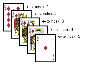
In this case, the numbers follow on another (1-5) but the same result can be obtained by using 5 different numbers. The important thing is the chronological sequence of the numbers (the order).
The code in the card example could look like this:
 #ten_of_diamonds {
  position: absolute;
  left: 100px;
  top: 100px;
  z-index: 1;
 }

 #jack_of_diamonds {
  position: absolute;
  left: 115px;
  top: 115px;
  z-index: 2;
 }

 #queen_of_diamonds {
  position: absolute;
  left: 130px;
  top: 130px;
  z-index: 3;
 }

 #king_of_diamonds {
  position: absolute;
  left: 145px;
  top: 145px;
  z-index: 4;
 }

 #ace_of_diamonds {
  position: absolute;
  left: 160px;
  top: 160px;
  z-index: 5;
 }
The method is relatively simple but the possibilities are several. You can place images on text or text above text etc.
Summary
Layers can be used in many situations. For example, try to use
z-index to create effects in headlines instead of creating these as graphics. For one thing, it is faster to load text and for another, it provides a potentially better ranking in search engines.
Lesson 16: Web-standards and validation
W3C is the
World Wide Web Consortium, which is an independent organization that manages code standards on the web (e.g. HTML, CSS, XML and others). Microsoft, The Mozilla Foundation and many others are a part of W3C and agree upon the future developments of the standards.
If you have been working just a bit with web design, you probably know that there can be a big differences in how a webpage is presented across different browsers. It can be very frustrating and time-consuming to create a webpage which can be viewed in Mozilla, Internet Explorer, Opera and all the rest of the existing browsers.
The idea of having standards is to agree upon a common denominator on how to use web technologies. This means that by observing the standards, a webdeveloper has a certainty that what he or she does will work in a more appropriate manner across different platforms.
We therefore recommend that you back up the work carried out by the W3C and validate your CSS in order to observe the standard.
CSS validator
To make it easier to observe the
CSS standard, W3C has made a so-called
validator which reads your stylesheet and returns a status listing errors and warnings, if your CSS does not validate.
To make it easier for you to validate your stylesheet, you can do it directly from this webpage. Simply replace the URL with the URL of your stylesheet below and click to validate. You will then be informed by the W3C site if there are any errors found.
If the validator does not find any errors; this picture will be shown, which you can put on your website to illustrate that you are using validated coding:

The validator can also be found at this link:
http://jigsaw.w3.org/css-validator/


